
Ex-Ante
I started off using a factor-based risk model to calculate a bottom up prediction of absolute risk (Total Risk in the lexicon of Barra Aegis). I looked at a broad market index, MSCI World Developed, over the last 10 years and used the Northfield Global Risk Model. One could see this as the predicted tracking error versus cash for the benchmark. I then averaged this data on a per-month basis across the years.

From the chart above we can observe the highest risk levels occur in and around January, and the lowest in and around October. Looking at a graph like this can be misleading, however, so I decided therefore to calculate a Welch’s T-test, and indeed none of the observations appeared significant. If we look at total risk levels over the last 10 years, it has varied quite a bit: from absolute highs around the tech bubble, to more moderate levels, and then back to higher levels more recently.

This led me to think that these differences in absolute levels might have some effects on the aggregated numbers. In order to control the variation in total risk levels, I also calculated the risk level relative to it’s three month trailing average.

This analysis confirms our earlier finding, that we find the lowest levels of risk around September, and the highs around the year end. Furthermore the Welch’s t test also confirmed that the risk is significantly different in September, December and January.
Ex-Post
In risk, one view is no view, therefore I also looked at risk from an ex-post or realized point of view. I wanted to look at measures that could be calculated on a monthly basis. I moved to Alpha Testing to analyze the cross sectional dispersion of returns. Again I focused on the MSCI World Developed over the last 10 years and first looked at the monthly standard deviation of returns.
In risk, one view is no view, therefore I also looked at risk from an ex-post or realized point of view. I wanted to look at measures that could be calculated on a monthly basis. I moved to Alpha Testing to analyze the cross sectional dispersion of returns. Again I focused on the MSCI World Developed over the last 10 years and first looked at the monthly standard deviation of returns.

We observe a similar pattern as for the predicted numbers, however it looks to be shifted a couple of months towards the beginning of the year. In other words we now find the lows in the summer rather than fall. I also looked at how the standard deviation developed over time. Again using the Welch’s T-test, it confirmed that the lower levels found in June to August are significantly different from the overall average.
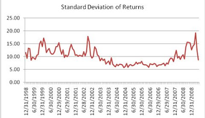
Also, here we see some peaks around the tech bubble, and the more recent period. The differences seem less extreme compared to the predicted risk numbers. To get some more feel for the return distribution, I also reviewed the average kurtosis to see if we observe any fatter tails during specific months.

Looking at the chart, we observe a similar pattern. The highest kurtosis from February to April and relatively low kurtosis is seen from May to August. Furthermore, the lows in July and September and the high in December exhibited a statistically significant difference when compared to the other months.
Ex-Ante vs. Ex-Post
So, it looks like the ex-ante and ex-post measures tell a similar story but the ex-ante figures seem to lag somewhat. Therefore, I thought it interesting to also plot the predicted absolute risk and measure standard deviation of returns over time in one chart. The scales are obviously not directly comparable as they are different measures, but we would expect them to move consistently.

It seems difficult to draw any hard conclusions from this chart, although there are a couple of interesting things to notice. Both measures peak around the tech bubble and in the more recent periods. However for the standard devation we notice some extra oscillation after the tech bubble, and also the recent volatility seems to be picked up earlier.
Furthermore the standard deviation seems a lot more volatile than the predicted risk number. There’s some intuition to support that, it uses one month of data whereas the risk model used to calculate the predicted numbers uses 60 months (exponentially time-weighted, though).
Therefore one would expect to have somewhat smoothed results using the risk model. To put it differently, the risk models will need some time to reflect changing market conditions. Along the same lines, this can also explain why the ex-ante seasonal effect lags the ex-post findings. Perhaps moreso than the seasonality of risk, this outlines why one would need to think about using a shorter or longer horizon model.
Conclusions?
So what can we conclude from the above? There are two points that caught my attention. The first was already on my radar and again shouldn’t come as a surprise, risk levels have risen lately. However plotting and seeing the effect on actual numbers, I didn’t expect the differences to be so clear. Secondly it indeed looks like there is some seasonality in risk levels. Or perhaps I should phrase that more conservatively: a constant level of risk should never be assumed!
So what can we conclude from the above? There are two points that caught my attention. The first was already on my radar and again shouldn’t come as a surprise, risk levels have risen lately. However plotting and seeing the effect on actual numbers, I didn’t expect the differences to be so clear. Secondly it indeed looks like there is some seasonality in risk levels. Or perhaps I should phrase that more conservatively: a constant level of risk should never be assumed!
This week's post was written by guest contributor Matthew van der Weide, Sales Specialist for Quantitative Services at FactSet's Benelux office.


No comments:
Post a Comment