Tuesday, December 29, 2009

2009 Year in Review

A collection of year-end summaries from our bloggers.


It was a busy year using new media to share current risk topics in various formats with our clients. We first launched our new risk website at the start of the year to house all of our new content. The site provides comprehensive information on our full suite of risk products including a recorded web demo of our risk workflow and links to our risk blog, podcasts, and white papers.

The blog and podcasts were a new direction for us this year and we received a very strong response from our clients about sharing current information via these new media. We blogged or podcasted on many of the most relevant risk issues this year including:

  • the Madoff scandal with Dan diBartolomeo (podcast)
  • the contribution of model failure to the financial crisis with Emanuel Derman (podcast)
  • the challenges of post-2008 risk modeling with Frank Nielsen (podcast)
  • a comparison of different risk model providers (eBook)
  • numerous commentaries on appropriately incorporating VaR analysis and Stress Testing into every day risk management practices

We hoped you enjoyed the new forms of information sharing from us this year and we look forward to expanding in this area in 2010.

Rick Barrett


When thinking about the items and events of significance that occurred during the past year, it's hard to look past the Global Financial Crisis itself. In many ways, 2009 has been a rough year as a result of the pain caused by the GFC and the ensuing so-called Great Recession. There are lots of negatives that people can and have discussed, but, if possible, I would like to put some positive spin on the GFC from the perspective of risk management. Prior to the start of the GFC, my experience in working for a company that supplies risk systems and models was more often than not one that could be characterized by a statement much like the abbreviated one I have created below.

Investment Firm Employee: "I do not necessarily have an opinion about risk estimation or risk modeling, and I do not even believe it is really relevant to our investing approach because we do x, y, and z. But the fact of the matter is that we need a system that can provide some basic risk information about our portfolio(s) to satisfy [government regulation/new mandate/prospects/clients, etc]."
The important thing to take away from the above statement is that for many investment firms risk management was clearly not part of the investment process and was really just a tick box in an RFP or something to include in a marketing report. Since the GFC, many firms have come to the realization that risk management should play a much more important role in the investment process. Firms are now taking the time to ask meaningful and relevant questions when contemplating risk systems and risk model providers. They are hiring people to not only monitor risk, but actually to provide feedback into the firm's investment process. In other words, risk management is finally beginning to live up to its name and becoming an integral part of many investment firms' portfolio management processes.

We are always taught in finance that investing is about the risk-return tradeoff. I think that 2009 and the GFC should be remembered as the wake-up call that forcefully reminded people of this relationship and that you cannot focus all of your energy on one part of it and totally neglect the other.

Andrew Kovaks


"But she must have a prize herself, you know," said the Mouse.

"Of course,"the Dodo replied very gravely. "What else have you got in your pocket?" he went on, turning to Alice.

"Only a thimble," said Alice sadly.

"Hand it over here," said the Dodo.

Then they all crowded round her once more, while the Dodo solemnly presented the thimble, saying "We beg your acceptance of this elegant thimble"; and, when it had finished this short speech, they all cheered.

- Lewis Carrol, Alice in Wonderland

When summarizing 2009 and looking ahead to the next decade, there is one person without whom no discussion of risk can take place: Ben Bernanke, the Time magazine Person of the Year 2009. He is no longer a firefighter that quickly steps in to put out a fire, he is a one-man committee to bring the prosperity back.

As Time put it:

"... He conjured up trillions of new dollars and blasted them into the economy; engineered massive public rescues of failing private companies; ratcheted down interest rates to zero; … blew up the Fed's balance sheet to three times its previous size; and generally transformed the staid arena of central banking into a stage for desperate improvisation."

It is certain that the events today will shape the financial landscape for years and decades to come. Will Ben Bernanke be able to put the world economy back on track and what do his actions mean for risk professionals? Firstly, I do not think that it is possible to create long-term prosperity by borrowing and printing money; otherwise every nation in the world would be rich (except those without credit and color printers, of course). The last person who “saved” the world economy in this manner was Alan Greenspan, who lowered the real interest rate to zero in 2003 and kept it there until the economy appeared to revive. This solidified his oracle status and this financial maestro was even able to quietly slip off off his pedestal into the private life before the financial dumbbells he threw up in the air (in the form of zero interest rates) started landing on the heads of the largely unsuspecting public. Creating growth with free money (read: leverage) inevitably leads to the events we know as Black Swans. Bringing liquidity to stop liquidity crisis is one thing, but what we are witnessing is far beyond that.

Why, you might ask, such a gloomy assessment for my 2009 year in review? Well, there are certainly happier things to write about, but none more relevant to the risk manager. Besides, risk managers have it within their power to help the public and other investment professionals understand why events once known as once-in-a-lifetime Black Swan occurrences are becoming as common as black cats in a pet store.

The transfer of the financial system leverage onto the shoulders of the US currency is going to demand much vigilance and alertness from the risk managers in 2010 and for years to come. Risk management will become more and more crucial to any investment firm, and this will also place a burden on the risk software providers to be less dogmatic and understand that the landscape is changing.

Risk management has been rising in importance over the past decade, though I think it hasn’t yet become important enough to actually affect the course of events, only to interprete them. I hope that the next decade changes the second part of that statement.

Happy Holidays!

Daniel Satchkov


To receive posts by e-mail in 2010, subscribe to this blog.

Thursday, December 17, 2009

Lessons learnt from a roller coaster decade

It’s the time of year where many people look on the year that was, what happened, why things happened, and what we can learn and wonder what will the future hold. As it’s also the end of a decade, I thought I’d have a quick look at the past decade in risk terms.

If you invested in any developed market index at the beginning of the decade, went to the moon or some desert island and came back this week, you would’ve found that the amount in your nest egg has gone down by a few percent. You could be forgiven for thinking not much happened in the past decade. Anyone who has been around will know this is far from what actually happened. The S&P 500 rose a few percent, fell 40%, rose 100%, fell 50%, and then recently rose 50% again over the decade to end down those few percent.

Long-Term Volatility

Similar to index levels over the decade, long-term levels of volatility haven’t changed much. The three-year standard deviation of the S&P 500 was 19 in 2001. While volatility dipped in the middle of the decade, levels currently are at 20. So long-term volatility is at levels seen a few times in recent history.

Short-Term Volatility

Short term volatility is telling a different story. Using the VIX as a proxy for short-term volatility in the S&P 500, short-term volatility hit an all-time high at the end of 2008 following the credit crisis and Lehman’s bankruptcy. This was at levels double what had been seen before. While levels have returned to more “normal” levels, recent highs are still on many investors’ minds.

Risk in the Industry

For various reasons, risk has become a more frequently used term within the investment community. Recent short-term events have had a big impact on fund managers and their day-to-day decision making. Investors are asking for more and more transparency from their fund managers. One aspect of this is risk analysis so they can better manage their risk-adjusted returns. The credit crisis, Madoff scandal, Lehman bankruptcy, and other events have contributed to greater oversight from governments and regulatory authorities. Tracking Error and VaR numbers are more frequently showing up in client reports. Everyone in the industry now knows that not all swans are white.

Has this increased emphasis on risk had an impact on portfolios? It appears so. While the level of volatility in the markets is slightly higher than levels seen at the beginning of the decade, average tracking errors appear to have decreased. Consider the Morningstar U.S. Large Cap Blend peer group. Looking at the tracking error of the quartiles over time, we see that the market volatility is slightly higher than it was at the beginning of the decade.

Relative risk by quartiles is actually down. Looking at the below chart, you will see that the 25th and 50th percentile tracking error decreases from about 8 and 6 earlier in the decade, to 5 and 4 more recently. Roughly 35% decreases in relative risk with market risk up slightly. Arguments can be made if this is due to better risk management or due to managers simply becoming more passive. But it does appear that increased risk management is having an impact.

Realized Tracking Error of U.S. Large Cap Quartiles
Future

What does the next decade have in store for us? The past decade was a roller coaster ride, only to return more or less at the start. I won’t give a predication on where market levels will be 10 years from now. But considering what we’ve learned in the last 10 years, its safe to say focus on risk management will only increase, will be more integrated in investment processes and will continue to get more sophisticated.
What are your predictions?

To receive future posts by e-mail, subscribe to this blog.

Thursday, November 19, 2009

My mother always told me if I concentrated, it would pay off

Upon reading a couple of articles lately regarding the pros and cons of holding concentrated portfolios (i.e., portfolios that hold relatively few securities), I decided to look at the impact of concentration and see if my mother’s advice would have paid off in terms of risk and risk-adjusted performance over the recent past.

Specifically I wanted to determine if investors were rewarded or penalized for investing in more concentrated strategies relative to more diversified portfolios. To investigate, I used the Morningstar U.S. Large Cap Equity Universe as my sample and quintiled the funds in that universe based on their number of holdings. I then used FactSet to calculate various measures of performance and risk for the first (most diversified portfolios) and last (most concentrated portfolios) quintiles. To allow for easy comparison I calculated averages for the quintiles at each point time for statistical measures I had chosen. I chose to focus on the period of January 2008 to October 2009 (the most recent 22 months). Since these are all supposed to be large cap portfolios, I used the S&P 500 as my benchmark for any benchmark relative calculations.

Let’s take a look at the results. First things first: how did the two groups compare in terms of performance? As you can see from the below chart, neither the Diversified (Q1) nor the Concentrated (Q5) groups outperformed the S&P 500 for first 13 months, though during this time the average of Quintile 1 portfolios clearly outperformed the average of Quintile 5 portfolios. What we can also see is a significant and consistent change of fortunes from February 2009 onwards, where Q5 seemed to benefit significantly from the market upswing.

The main thing I would like to understand is whether the improved performance we see above was achieved as a result of taking on substantially more risk. Also, on a risk-adjusted basis, which group of portfolios outperformed the other? Let’s take a look at a few different measures to see if we can uncover any trends.
Above we see the average volatility of the two groups of portfolios over time. The chart clearly shows that in terms of absolute volatility there is actually little difference between the two groups of portfolios over the last 22 months.
Now when we look at a relative measure of risk like the above Tracking Errors relative to the S&P 500 we do see that, as expected, the more concentrated portfolios (Q5) appear more risky relative to the broad market index. To answer our questions, we need to determine whether or not the managers of concentrated portfolios were able to more efficiently manage their portfolios by adding appropriate levels of performance for their increased relative risk.

To wrap things up, I examined the average annual Information Ratios of Quintile 1 vs Quintile 5, and it does appear that more concentrated portfolios (Q5) on average do a better job of managing the risk-return tradeoff as evidenced by the higher IRs. Obviously this is far from conclusive, but my quick analysis of the situation indicates that during the period of high volatility we have seen over the last 12 months or so, the more highly concentrated portfolios have done a better job than their highly diversified peers.

So maybe my mother was right; if you concentrate you will do better. I would like to know what the general consensus is amongst our readers – during volatile times would you rather hold a highly diversified portfolio or a very concentrated one, and why?

To receive future posts by e-mail, subscribe to this blog.

Monday, November 16, 2009

Register for our "Alpha vs. Risk: Where Should I Spend My Time" live webcast

FactSet's risk management webcast series, focusing on helping you produce alpha and create performance-enhanced portfolios, wraps up this week with Alpha vs. Risk: Where Should I Spend My Time? The live event will be Wednesday, November 18 at 2:00 p.m. EST/11:00 a.m. PST.

Register for this session now! Space is limited and available on a first-come, first-served basis.

The presentation is hosted by Steve Greiner, Ph.D., former Head Quantitative Strategist and Portfolio Manager for National City Bank.

Steve will discuss the practical and theoretical issues regarding which piece of the portfolio management process adds more value: searching for alpha or forecasting risk. First Steve will review tracking error and asset allocation, and how their misunderstanding and misapplication contributed to the 2008 meltdown. Second, he'll discuss risk vs. alpha and consider each of them separately, then show why you need to consider them simultaneously, concluding with examples.

Steve was the Head Quantitative Strategist and a Portfolio Manager for the institutional asset manager arm of National City Bank (pre-merger with PNC). He was a key member of the Allegiant Structured Equity team, sitting on the Investment Committee and leading several strategies and being an integral contributor to other investment teams. In addition, Steven leverages his expertise to test quantitative processess employed by Allegiant's other investment teams and has firm-wide risk management responsibilities. Joining Allegiant Asset Mgmt in 2005, he previously served as the Large Cap Quantitative Head and Research Director for Harris Investment Managment and has 21 years of quantitative and modeling experience. Steven received his B.S. in Mathematics and Theoretical Chemistry from the University of Buffalo and his M.S. and Ph.D. in Chemical Physics from the University of Rochester, along with Post-Doctoral experience from the Fachberiech Physik from the Free University of Berlin.

Send your questions for Steve via Twitter @FactSet to be answered during the webcast.

Tuesday, November 10, 2009

Bets are looking Beta by nature

As a FactSet blogger focused on the nature of the risk being seen in the market, it has been interesting to watch how the rally that started back in February has turned from a "dead cat bounce" into the "start of a new bull" run via a "reaction to an overcorrection" as time has given commentators that little extra piece of information on which to base their comments. Indeed, in the history of this blog, I myself have tried myself to base a forecast of future events on what was available at that time only to see the market deliver a different result and subsequently looked for further explanation.

I thought that this week, therefore, I would merely commentate on what can be seen and let you the reader agree or disagree and then set your own expectations.

I wrote a month ago that there seemed to be a lack of conviction in the positive run on the market through observation of the amount of cash that active managers were still keeping in terms of asset allocation, and while the continuing rally has seen that allocation reduce, it is the nature of this reallocation that I want to examine.

I therefore present the below chart of percentage contribution of factor risk when comparing the active index Lipper Large Cap Core against the S&P 500. (I have generated the data using the APT United States factor risk model as by its nature it separates systematic risk from unsystematic without any pre-specification of factors and, therefore, is free from any potential bias that another construct might be accused of introducing.)

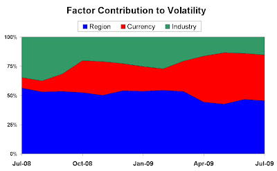
The chart shows how the nature of the risk over the last couple of years has varied in terms of the systematic contribution.

June 2006 showed the active risk taken on average to be split approximately 50/50 between systematic and stock specific, rising in late 2007 to around a 65/35 split. This timing coincides with the general realisation that a huge number of quantitatively driven processes were actually very parallel in nature, underlined through the liquidity squeeze and bringing about a rethink in these methods.

Late 2008 shows another spike where the general run on the markets (including the fall of Lehman Brothers) can be observed through an increase in factor correlations as again a large number of investors moved together. The fall back from that high is more a reflection of the rise in stock specific risk (e.g., holding RBS vs HSBC, Ford vs Chrysler) rather than a more uniform move towards stock selection.

Now consider the most recent observations of factor risk accounting for over 80% of total active risk. There has been a general rise in tracking error of the index without a parallel rise in general variance, implying that managers are taking on more risk. The reasons for this are perhaps an increasing confidence or alternatively through facing rising opportunity costs of not being in the market. What this chart does show is that the risk being taken on is extremely systematic in nature, asset allocation is the major factor in active management rather than stock picking.

I suggest several reasons for this:

  1. There is still a lack of confidence in the equity markets and therefore the systematic nature is reflecting a straight in/out decision.
  2. Managers are taking a short-term view and therefore getting exposure through liquid instruments such as ETFs which would bias the risk profile in this way.
  3. There is an acceptance that chasing alpha is much harder than used to be believed and that a more beta-biased methodology is more consistent.

Readers, I'd like to hear your thoughts. Do you agree or disagree with what I've written over this past year? What are your expectations as 2009 comes to a close?

To receive future posts by e-mail, subscribe to this blog.

Monday, November 2, 2009

Register now for our live "Finding Alpha" webcast

Join FactSet for a series of insightful risk management webcasts, focusing on helping you produce alpha and create performance-enhanced portfolios.

FactSet's Wednesday webcast series starts November 4 at 2 p.m. EST/11 a.m. PST with Finding Alpha.

Register for this session now! Space is limited and available on a first-come, first-served basis.

Led by Dorie Kim, FactSet Quantitative Analytics Specialist, the session will focus on finding an alpha factor that fits your portfolio management process. Finding this factor involves understanding the returns, correlation and predictive power of factors through time, across different subgroups of securities. Learn more about the workflow of generating a stock scoring model that will be used in backtesting and production environments. Most importantly, find out how to produce alpha and create performance-enhanced portfolios with stop loss and lock gain rules.

Next, you'll move into a discussion of market risk and creating your own custom risk models. FactSet merges our alpha factor with common market risk factors such as beta, size, valuation and sectors, to create a risk model. This risk model will measure how well our alpha factor has been working and determine if the portfolio has effectively incorporated the potential alpha.

Dorie J. Kim is a Quantitative Analytics Specialist at FactSet. She is responsible for providing factor modeling, portfolio backtesting, and optimization tools as well as risk management solutions to a diversified client base in the West Coast. Prior to joining the group in 2008, she worked as a FactSet consultant supporting more than 20 buy-side firms in the Bay Area and New Mexico. She holds a BS degree in electrical engineering from the University of California, San Diego.

See the full series at www.factset.com/huntforalpha.

Extrapolation revisited

In a previous post, we discussed the prospect of inflation and how one might create appropriate stress for such a scenario on FactSet. The specific example we discussed raises a more general question of the proper design of stress tests. Remember, the problem that we encountered was that most models did not have history that contained any significant rise in CPI. The highest CPI rise observed in the past 20 years was about 5%, while we wanted to see what a 10% rise will look like. The premise of our search was that 5% is fundamentally different from a 10% rise when we are talking about CPI, and thus it would be inappropriate to simply linearly extrapolate from 5% environment to the 10% environment (a scalar of 2).

What is the general idea at work here? Do we always have to observe in history some number of exactly the same impacts as we are trying to model, in order for the covariance structure to make sense? If not, what kind of extrapolation is appropriate and what kind is not? We will first provide some guidelines, and in the next post will dwell more on the reasoning and theoretic economic issues involved.

In general, the process of stress testing should force the practitioner to answer the following questions (we are talking only about factor stress tests, since historical stress testing design is quite obvious):

Question 1: What kind of impact are we trying to model?

Stress testing is not about predicting specific events like particular company’s default or a natural disaster. It is all about impacts. In order to properly design stress tests, you have to think about stress testing as a tool that allows you to examine systematic weakness in your portfolio. The best analogy for the process is car crash testing, where a designer cares not about what may cause a particular accident, but rather about a limited number of possible impacts. That is why we use the term Portfolio Crash Testing when referring to stress testing.

The impacts can come from a few categories:
  • Broad market impacts described by indices such as S&P 500

  • Sector impacts described by indices such as S&P Financials or S&P Technologies

  • Economic variables in a loose sense of this term (e.g. oil, gold, CPI, GDP…)
Sometimes it is useful to combine from the same or multiple categories. Our multiple factor stress testing functionality was designed specifically for that purpose.

Question 2: Now that we decided on the financial impacts we are modeling we have to ask; is the model in use well suited for modeling this impact?

The model is well suited for our task if there were similar impacts observed in its history. Similar does not mean exactly the same. A useful simplification for the purposes of stress testing is to think about each of the above mentioned factors as roughly two kinds of behavior. One kind could be characterized as more or less trading range; this environment as we will see in the second part of the post is what is usually described by the economic theory as an equilibrium or near equilibrium state. The relationships between assets (described in the case of most risk models as correlations) are mostly stable.

The second kind of an environment is one in which changes are sharp and the relationships can rapidly change (e.g., rise in correlations). This is the extreme environment in which market participants lose any sense of equilibrium, and supply and demand fluctuate sharply, possibly becoming strongly mismatched. If we have some observations of the extreme variety, it is fair to extrapolate from them, even if the magnitude of our stress testing shock is considerably larger. For example, if we saw a 30% decline in S&P 500, it is fair to extrapolate to 50% or even 60%, because the events differ in degree, but do not differ qualitatively in a major way. However, if nothing that we could call a major shock was observed in the sample to a given factor, linear extrapolation is likely to be hopelessly wrong. This goes for inflation. A 10% inflation is fundamentally different to the economy that 2 0r 3%, even 5%. That is why linear extrapolation from existing CPI data will not work.

We should be clear that for vast majority of the impact the risk model has some observations from the extreme sample; therefore it is quite fair to extrapolate as long as those extreme observations get enough weight in a calculation of the covariance matrix (see next question). In summary, we assert that market conditions when, for example, the S&P 500 went down significantly in 1998 are similar to those observed in the 2008 crash and will be similar should another major sell-off occur. There are many reasons for this and we will elaborate on some in the follow-up to this post.

Question 3: Should I use the Event Weighted or Time Weighted method for stress testing?

A detailed discussion along with empirical testing can be found in Tail Risk and VaR: Reconciling Theory with Reality in FactSet’s Portfolio Analysis. In short, Event Weighted is suited best for extreme impacts, because it overweighs the extreme observations in the calculation of the covariance matrix. Since stress testing is mostly concerned with major impacts, the Event Weighted method is preferred in majority of cases. The Time Weighted method should be used when we want to determine portfolio moves in the environment where the relationships will stay as they are now and were recently (i.e., no sharp disequilibrium occurs). It is important to note that in times of major market reversals Time Weighted and Event Weighted methods converge, because the Time Weighted method assigns higher weight to the recent observations which also happened to be extreme.

There is one more question remaining.

Question 4: What if we are trying to model something that has no precedent in the history of the model, e.g., a significant rise in CPI?

The way to approach this problem is to consider other impacts that may become highly correlated with the one we are trying to model if a major move in one of them occurs. For example, when we were designing our stress testing product in 2006-2007, one of the most interesting shocks that we wanted to test was a significant decline in housing prices. However, significant declines in housing had not yet occurred, and there were no broad home price declines in the history of the models. This led us to consider what else would happen if housing were to drop significantly. The first and obvious observation was that the financial sector was likely to suffer a great deal in a falling home price environment. Thus, we designed tests around major declines in S&P Financials and called them housing price stress tests. Subsequent events showed that our hypothesis was correct and portfolio reactions were reasonably accurately predicted. Another useful, if more complicated, example is inflation. In the previous post, we described such an inflation proxy test by simultaneously shocking gold up 40% and keeping real estate flat. We chose to stress gold up 40% and housing prices 0% (flat) for the following reasons. Gold up is a well known inflation hedge, because it really has no reason to move outside of inflation of the money supply. However, it was rising very significantly from 2001 to now, even though there was not a large consumer inflation for most of this period. But how is that possible?

Our hypothesis was that the inflation really was there all along, but it was channeled into assets like real estate and financial assets. It was kept out of the consumer products, because China was exporting deflation. The way that China did it was by keeping their currency artificially low vs. the U.S. Dollar. In other words, they forced their citizens to underconsume, since their currency was worth less than it otherwise would have been had the market forces been allowed to play out. This coupled with the fact that China is a key exporter of consumer products to the U.S. kept consumer prices artificially low. The significant inflation of money supply which was going on since at least 2002 was channeled into assets like real estate and financial assets, as we said above.

What did China get out of this symbiotic relationship? It got to build a huge production base to position itself as the economic powerhouse by using U.S. consumption at the expense of the underconsumption of its citizens as the engine of growth. What did the U.S. get out of it? The U.S. got the ability to lower the Fed Funds rate without paying the price of the consumer price inflation and the resulting instability.

All this long reasoning explains why creating a stress test with only gold prices up 40% was not enough to model this scenario. It would have simply given us the asset inflation scenario that we observed in 2002-2008. That is why we explicitly added the cap to the real estate return of 0%. The flat real estate return suggested that we want to see the impact of a 40% rise in gold prices without the asset inflation component (since real estate was the major beneficiary of asset inflation), that is we want to see a consumer inflation.

As you can see the process of creating proxy tests is quite elaborate and requires much more effort in the design stage. We believe that it is fairly infrequently that we have to resort to this approach, but when we do it can be of great value.

In my next post, we will trace the origins of the equilibrium thinking back through Harry Markowitz to the work of Leon Walras and will show why the Event Weighted method corrects for the problems inherent in assuming financial market runs as “a constant and known statistical process” ( as quoted in a Basel Committee on Banking Supervision report).

Make sure you see part two of this entry by subscribing to this blog.

Thursday, October 29, 2009

What are the dangers of using a short-term, downside measure for a fund with a long-term investment horizon?

We received a comment on my VaR vs. Tracking Error: The flawed debate post that is worth its own post as an answer.

Reader "P" asked:

"What do you consider to be the most significant dangers of using a short-term, downside measure (e.g., VaR) for a fund with a long term investment horizon? Is there much literature on this? Presumably much of it is behavioural?"

P, thank you for your question. It sparked a spirited debate internally amongst our blog contributors. Collectively, this is our answer to your question.

First, we believe there are two questions implicit in the one you asked:

1. Why would a long horizon manager need to look at short-term risk?

Long horizon models have long half-life by definition. As a result, when a market reversal occurs after a period of low or moderate volatility, long-term models become wildly out of sync with a market for at least 3-4 months. In this case, the only model that can give reasonable risk readings is a short-term model. This has nothing to do with a provider, but is inherent in a long horizon model's construction. If one could afford to be without any risk readings in times of turbulent market reversals, then one could stick with only a long-term model.

2. Is there a danger of whip-sawing?

We tend to agree with you that this problem is behavioral. If the portfolio has a long-term horizon and is down significantly in the short-term, it is reasonable to wonder whether the portfolio manager, senior management, and/or the client will remain committed to its long-term horizon. If not, then the short-term downside risk can’t be ignored.

So, if the danger of whip-sawing is real, this turns into a question of how a long horizon manager uses the short-term model. Obviously, short-horizon managers will use a model in a different way, because their bets are on the same horizon with risk, so they can weigh risk-return tradeoffs on the same frequency. For a long horizon manager, a short-term model is not a day-by-day investment tool, but rather yet another reading on a dashboard of relevant market indicators. It is an FYI when markets are tranquil. It becomes crucial and a source of actionable intelligence in turbulent times.

We welcome your questions! Please leave comments on any post and we will respond here or to you directly.

Thursday, October 22, 2009

Flushing returns down the volatility drain with Leveraged and Inverse ETFs: part 2

This week, I will follow up on a blog from several months ago in which I discussed how volatility can destroy returns in leveraged ETFs. I received several comments on that blog and continue to see articles written about leveraged ETFs in various publications so I thought the time was right for a continuation. The crux of the original blog was that compounding kills performance, particularly in times of high volatility, such that the long-term returns of leveraged ETFs are actually quite unpredictable. They meet their objective over the short horizon, like intra-day or one day, but multiplying the long-, mid-, or even near-term performance of the index by 2 or 3 (or -1, -2, or -3 for inverse ETFs) does not produce an accurate estimate of the performance of the leveraged ETFs over that same time period.

This week I will add some empirical data to the analysis. But first a pop quiz.

Listed below are the names and one-year returns of the Russell 2000 along with the ProShares 2x, inverse 1x, and inverse 2x Russell 2000 ETFs. Can you match each security to its return?

Read on for the answers.

1) ProShares UltraShort Russell 2000 ETF (Inverse 2x)
2) ProShares Ultra Russell 2000 ETF (2x)
3) Russell 2000 Index
4) ProShares Short Russell 2000 ETF (Inverse 1x)

a) -62.3%
b) -31.4%
c) 1.9%
d) 14.1%

The Russell 2000 is up 14.1% over the past one year (#3 goes with d). Does it surprise you that the 2x ETF is up only 1.9% over the same period? That 2x ETF returned about 1/7 of the performance of the underlying index! The inverse 1x returned -31.4% while the inverse 2x returned -62.3% which equates to over four times the inverse return of the index! Were these ETFs managed poorly?

To test, we need to look at the daily returns of the Russell 2000 and multiply each day’s return by the leverage factor of each ETF. Then, we can compound the adjusted daily returns. The Russell 2000 index itself is up 14.1% over the last year. Assuming perfect daily replication of 2x the index, the return would be 3.7% over the same period compared to the 1.9% returned by the 2x ETF. Perfectly replicating the -1x inverse index and -2x inverse index each day would return -29.9% and -60.8% respectively, approximately 1.5% higher than the equivalent ETF. It is much more the case that compounding in a very volatile market led to the seemingly poor performance rather than poor management of the funds.

In fact, that period was one of the most volatile periods in the last 20 years, with a 2.98% daily standard deviation of the Russell 2000. How big an effect can volatility have on leveraged and inverse ETF performance? Let’s take a look at another period.

1995 was a year of particularly low volatility. The daily standard deviation of the Russell 2000 that year was only 0.51%. Of course there were no leveraged or inverse ETFs back then, but we can approximate by multiplying each days return by the leverage ratios and compounding. The Russell 2000 returned 28.45% in 1995. The returns of the hypothetical ETFs from that time are shown below. In all five cases, the returns of the leveraged ETFs are higher than expected by multiplying the full year Russell 2000 return by the leverage ratio.


The tests run for the S&P 500 ETFs returned very similar results. The one year performance data for all ETFs tested are below.


Not surprisingly, the 1x ETFs performed almost exactly as expected over the year since daily volatility has no affect on long term replication in this case. These are the only ETFs that should be considered for long-term inclusion in one's portfolio. Leveraged and inverse ETFs do have their place for short-term hedging and other very short-term strategies, but not for the long-term investor.

You should consider your rationale and time frame for investing in these assets. Investors do seem to understand this point, as trading activity (average daily volume divided by shares outstanding) is considerably higher for the more highly levered ETFs.

To receive future posts by e-mail, subscribe to this blog.

Wednesday, October 14, 2009

The reports of my death are greatly exaggerated

Hardly a day goes by without seeing a headline in a financial publication about the decline of the U.S. Dollar. Making the case for a weaker dollar and How to avoid greenback grief are two articles that appeared on the same page of the commentary section of the Financial Times on the same day this week. Last week, The Independent published a story titled The demise of the dollar. There are a variety of reasons for this which have been discussed at length in these and other articles (for example, OPEC countries threatening to price oil in a currency other than USD, low interest rates in the U.S. vs. other countries, low expected growth rates in the U.S. vs. the rest of the world, etc).

In recent posts, Sean Carr spoke about the rise of currency risk in portfolios and what would happen if the dollar strengthened. Oh, how times change. After a bit of resurgence from the end of July to middle of August, the greenback looks to be in a downward spiral. Public opinion (or at least many of those expressing their opinion in the press) seems to expect this to continue.
A weaker dollar will no doubt help many American exporters and foreign tourists who wish to visit the U.S. But how will it affect the equity markets? Using FactSet’s stress testing tools, I’ll examine the effects of a 30% decline in the $, from the perspective of a U.S. investor. I’m using a dollar index against a handful of currencies, as published by the Fed Reserve. I’ll use the R-Squared Global Equity model, using Northfield and Barra will produce similar results.

This stress test shows the S&P 500 increasing almost 27% in this scenario. The Materials and Financials sectors are the big beneficiaries. Materials companies benefit from higher commodity prices due to a weaker dollar. Defensive sectors such as Health Care and Consumer Staples are poor performers on a relative basis.
Moving to the MSCI World ex U.S. index, the stress test predicts an increase of about 50%, significantly more than the U.S. market. The sector story is similar to the S&P. Materials and Financials benefit, Health Care and Consumer Staples underperform.

On a country basis, Hong Kong and Japan underperform, while Europe outperforms. The strengthening Euro helps many European stocks. A weakened dollar will hurt Japanese exporters, as the U.S. consumer accounts for a quarter of exports from Japan. Many Hong Kong stocks have significant operations in China, and the Chinese Renminbi is of course currently pegged to the dollar.
Now that we have a general sense of what will happen in the event of a large decrease in the dollar, how are portfolio managers positioning themselves in case of a dollar decline? Using the Lipper Active Indices, we can get an idea of how the average active fund manager in a given strategy is positioning their portfolios. Let’s use the Lipper International Active index against the MSCI World ex US benchmark. Here, in the $ decline scenario, the active index would underperform its benchmark by about 4 percentage points. On a sector basis, significant underweights in Materials and Financials contribute to the underperformance. On a country basis, overweights in underperforming USD stocks, cash, and Hong Kong stocks and underweights in outperforming Canadian and European stocks are major contributors to this underperformance.

Many in the financial press believe that the dollar is on its last legs and expect a continued decline in the greenback. From this analysis, I draw two conclusions. One, the average fund manager may not be adequately positioned for large decline in the dollar. Or two, he/she may think all the reports of the dollar’s death are "greatly exaggerated,” stealing a line from Mark Twain when he heard about his obituary in the paper.

Don't miss a post! Subscribe by e-mail to receive new entries as soon as they are available.

Monday, October 12, 2009

Taking Risk welcomes new global contributors

We're expanding our horizons! Since starting in January, Taking Risk has featured one UK-based and three U.S.-based bloggers. Now we're adding three more to represent Europe, Asia, and Australia. Watch for entries from these new contributors in the coming weeks.

Willett Bird, Hong Kong
Willett is the head of FactSet's portfolio and quantitative efforts in Asia, covering Japan, Korea, and Southeast Asia. He joined FactSet's Connecticut headquarters in 1997 as a Consultant before moving to Hong Kong in 2000 and assuming his current position in 2003. Willett graduated from Georgetown University and will be finishing a joint degree MBA from the Northwestern Kellogg School and the Hong Kong University of Science and Technology in June 2010. He holds the CFA designation.

Bryan Hoefs, London
Bryan is the UK Manager of FactSet's Portfolio Analytics group, where he manages and develops portfolio and quantitative applications. He joined FactSet in 2001 as a Consultant and has been part of the Portfolio Analytics team since 2003. In his position, he works with portfolio managers, hedge funds, and risk and performance teams in a variety of areas, including risk analysis, long/short analysis, multi-manager and fund of fund analysis. He graduated from the University of Wisconsin - Madison and holds the CFA designation.

Andrew Kovacs, Sydney
Andrew heads FactSet’s portfolio and quantitative efforts in Australia. He joined FactSet in 2000 after working at the Bank of New York for two years. Andrew held portfolio and risk roles in New York and Tokyo before assuming his position in Australia in 2008. He graduated from Boston College and is also a CFA charter holder.

Don't miss a post! Subscribe by e-mail to receive new entries as soon as they are available.

Thursday, October 1, 2009

Black Swans and Money Helicopters: Staying Ahead in a Nonlinear World

In the spirit of the previous post by Sean Carr, we'd like to begin with an excerpt from Charles MacKay’s Memoirs of Extraordinary Public Delusions and the Madness of Crowds. In the chapter dealing with John Law’s Banque Royale we find the following reasoning emanating from the mind of France’s then Regent Duc D’Orleans:
“If 500 million of paper (money) had been of such advantage, 500 million additional would be of still greater advantage.”
It is a curious fact that almost 300 years after that statement was made, we can all sort of sense what the Duc must have been thinking, even if we don’t know much about John Law and his exploits. But curiosity is not the reason we started with this quote. The real reason is in that it illustrates one of the most vicious fallacies in our thinking about the world around us: linear extrapolation. Some quantity appears to have done some good; twice as much should be twice better. Whether it is fortunate or not, the world is not the linear place. Double the quantity of a good thing, and the results may not be what you expect. This goes for exercise, food, alcohol, medicine, and even leisure (though the last one is debatable).

So, today we are wondering: are the central banks around the world going to overdo it? Are we going to get inflation in place of the credit crunch? We don’t know, but in the world of risk it pays to think about the possibilities. Before we offer our analysis, let us be clear about what we are not intending to do. We are not going to argue whether it was worth to take the stimulative steps that have been taken. If anything, we tend to agree that the prospect of financial meltdown was so real that some drastic measures were necessary. Our purpose is to merely examine where we are, where we are likely headed, and how to prepare for it.

Where We Are
Some of us may have thought that the stabilizing actions of the Fed were of the improvised fire fighting variety. In fact, Ben Bernanke has outlined many of the measures currently taken as early as 2002 in a speech before the National Economists Club in Washington, D.C. In it he described the steps that would be taken in a zero Fed Funds Rate scenario (we bring our apologies for the extensive quotation, but after all if you want to know where you are it is worth asking the driver):
“Because central banks conventionally conduct monetary policy by manipulating the short-term nominal interest rate, some observers have concluded that when that key rate stands at or near zero, the central bank has "run out of ammunition"--that is, it no longer has the power to expand aggregate demand and hence economic activity…

However, a principal message of my talk today is that a central bank whose accustomed policy rate has been forced down to zero has most definitely not run out of ammunition…

Indeed, under a fiat (that is, paper) money system, a government (in practice, the central bank in cooperation with other agencies) should always be able to generate increased nominal spending and inflation, even when the short-term nominal interest rate is at zero.

The conclusion that deflation is always reversible under a fiat money system follows from basic economic reasoning. A little parable may prove useful: Today an ounce of gold sells for $300 (remember, this is 2002), more or less. Now suppose that a modern alchemist solves his subject's oldest problem by finding a way to produce unlimited amounts of new gold at essentially no cost. Moreover, his invention is widely publicized and scientifically verified, and he announces his intention to begin massive production of gold within days. What would happen to the price of gold? Presumably, the potentially unlimited supply of cheap gold would cause the market price of gold to plummet. Indeed, if the market for gold is to any degree efficient, the price of gold would collapse immediately after the announcement of the invention, before the alchemist had produced and marketed a single ounce of yellow metal.

What has this got to do with monetary policy? Like gold, U.S. dollars have value only to the extent that they are strictly limited in supply. But the U.S. government has a technology, called a printing press (or, today, its electronic equivalent), that allows it to produce as many U.S. dollars as it wishes at essentially no cost. By increasing the number of U.S. dollars in circulation, or even by credibly threatening to do so, the U.S. government can also reduce the value of a dollar in terms of goods and services, which is equivalent to raising the prices in dollars of those goods and services. We conclude that, under a paper-money system, a determined government can always generate higher spending and hence positive inflation.

Of course, the U.S. government is not going to print money and distribute it willy-nilly (although as we will see later, there are practical policies that approximate this behavior). Normally, money is injected into the economy through asset purchases by the Federal Reserve. To stimulate aggregate spending when short-term interest rates have reached zero, the Fed must expand the scale of its asset purchases or, possibly, expand the menu of assets that it buys. Alternatively, the Fed could find other ways of injecting money into the system--for example, by making low-interest-rate loans to banks or cooperating with the fiscal authorities…

If we do fall into deflation, however, we can take comfort that the logic of the printing press example must assert itself, and sufficient injections of money will ultimately always reverse a deflation…

The Fed can inject money into the economy in still other ways. For example, the Fed has the authority to buy foreign government debt, as well as domestic government debt. Potentially, this class of assets offers huge scope for Fed operations, as the quantity of foreign assets eligible for purchase by the Fed is several times the stock of U.S. government debt.
Alas, the alchemists never found the philosopher’s stone and gold is still in limited supply. Today’s financial alchemy of central banking does not even require a printing press; the money is created electronically. Credit markets now appear to have stabilized, and economic data in many parts of the world shows signs of increasing output, so what is next?

Where We Are Headed
One of the best books on inflation is Milton Friedman’s Monetary Mischief. In it he attempted to answer many of the questions that we are asking. What would happen, he asked, if a helicopter were to simply fly over and drop the money from the sky? (Ben Bernarke also used the helicopter metaphor.) The precise sequence of events is impossible to predict, but there are some generalizations that can be made from empirical evidence.

In the short run, according to Friedman, the increase in money supply will show up in an increased output without affecting the price level. Interest rates also decrease in the short run. This short run has usually lasted 6-9 months. The effect, however, shows up in the rising prices in the longer run, usually 12-18 months after the short run effects have commenced. Therefore, it is reasonable to expect inflation to pick up within the next year or two. It is impossible to suggest the level of inflation, because the adjustment may be drawn out with ups and downs along the way. The matter is complicated by the Fed’s decision to stop reporting M3 figures, which would help in gauging the level of the brewing inflation.

How Long Will The Inflation Last (Or Will The Real Paul Volcker Please Stand Up)
Just as there is a lag between the increase in money supply and the effect on prices, so there is a lag between the implementation of the inflation fighting program and reduced inflation. In other words, once started, inflation cannot be stopped quickly. It took Paul Volcker at least two years to stop the inflation in the early 80s at the cost of raising the short term interest rates as high as 18% at one point.

However, in our present situation, it will take considerably longer. The reason is that unlike the early 80s, both the U.S. Government and U.S. Consumer are heavily indebted. The net savings rate is around zer0, and U.S. debt is close to $10 trillion not counting the implied guarantees. In such a scenario, significant increase in the interest rates would be difficult to say the least. Continued increase in the money supply on the other hand reduces the real debt load. To summarize, inflation will likely go on for a while.

Stress Testing The Inflation
If the risk model we are using (FactSet offers models from Barra, Northfield, R-Squared, and APT) had history back to the early 70s when high inflation was last observed, this stress test would be as easy to set up as any factor test (for example a 30% decline in S&P financials). To set up the inflation stress test we would simply find the data series for CPI and use Stress Testing horizon feature to specify something like a 10% increase over 12 months. However, the only model with that much history is Barra’s U.S. Long-Term Model (USE3L). Here is the result:
As we can see, the nominal return to S&P 500 is almost exactly flat in our test. The four worst losers are Automobiles and Components, Banks, Consumer Durables and Apparel, and Diversified Financials. The biggest winner is Energy, followed by Pharmaceuticals, Food, Beverage and Tobacco, and Health Care Equipment and Services. It is important to remember that these are statistical predictions, the order and magnitude matter, while precision does not. -14% and -17% are likely to be statistically equivalent.

But most risk models do not go back before the 1980s. How could we possibly use stress testing to ascertain the effect of inflation on a given portfolio when nothing in the recent history of the risk models gives us any idea of what a high inflation environment looks like? In general, stress testing the relationships that have not been observed or have been significantly altered in the recent history is difficult. However, it is certainly possible. As we were doing empirical research in the Fall '07-Spring '08 on our stress testing engine, we asked the following hypothetical question: How would we stress test the effect of a nationwide decline in housing prices on a stock market portfolio? Our situation at that point with respect to declining housing prices was similar to our situation today with respect to rising inflation. Both did not yet take place and were not observable in the recent model history. We had to make an expert judgment on finding the market metric that was both observed and highly related to the object of our study. As a result, we chose to stress test the S&P Financials decline in place of the housing decline judging that the latter if it occurs is bound to be shortly followed or preceded by the former. We did have significant financial declines in our available sample, particularly the LTCM related mini credit crunch in 1998. Subsequent events of Fall 2008 showed that our conjecture was valid and was giving valuable results approximating well the effects of declining housing market (see Portfolio Crash Testing).

Applying this logic to the stress testing of inflation, we designed the following test which uses the multiple shock functionality of our system: Gold up 40% and simultaneously Case-Schiller Real Estate Index flat 0%. We believe that such a test will approximate the conditions likely to be observed if inflation picks up significantly. The Inflation-Gold relationship is obvious, but what about flat Real Estate prices? Why are they necessary? The reason is that we want to separate two types of inflations: broad Consumer Price Inflation from the Asset Inflation. The money supply started growing before 2008. In fact, the last reported growth rate for M3 was around 18% in 2006. Throughout the early 2000s, money supply growth was mostly pushed out of consumer prices and into commodity and asset (financial and real estate markets) by the consumer price deflation exported from China and other low-cost producers. The environment that we want to test is the broad consumer inflation and that is why we explicitly add the zero real estate growth parameter. The result using Northfield Global Model is shown below:
The best performer again is Energy, just as expected. The next best is Utilities, followed by Pharmaceuticals, which paints a slightly different picture. The worst performers are again Automobiles and Components and Consumer Durables along with Retailing. The Real Estate stocks are down slightly likely because flat nominal Case-Schiller Index actually means some loss in real terms for the housing market. It could be argued that an alternative specification could be that the real estate prices could go up in nominal terms staying flat in real terms.

The next step after examining the portfolio level impacts of the stress test should be to go into one of the asset level reports in the Portfolio Analysis, for example, the Weights report. This would allow for the decomposition of portfolio impacts within the portfolio subsectors and industries and down to security level.

As we have seen, it is possible to go beyond traditional factors test to approximate factor shocks that have not been observed in our sample. We close with the observation that many of the events considered to be Black Swans (completely unpredictable in substance or timing) are really more of Grey Birds (anticipated by some experts in substance, but unpredictable with respect to timing or specific sequence). The fact that the timing or sequence of shocks is not known should not deter us from having them on our Stress Testing radar.

Additional contributions by Chris Carpentier, FactSet Portfolio Product Developer

To receive future posts by e-mail, subscribe to this blog.

Friday, September 18, 2009

I walk slowly, but I never walk backwards. Have you moved forward with your risk awareness?

The internet is a huge and seemingly all-knowledgeable place sometimes. When I went looking for a quote using the word "slowly," I not only found the the above by American President Abraham Lincoln, but also a whole 45 minutes-worth of other interesting reading from a huge breadth of people and eras, including this famous and rather apt line from Charles MacKay:
"Men, it has been well said, think in herds; it will be seen that they go mad in herds, while they only recover their senses slowly, and one by one."
There was a consistency in many of the quotes, including these two, underlining the recognition that learning and acceptance can be a slow process which panic and ignorance can quickly offset, but that it is one that we must all stay committed to.

What topic is it that brings me to this introduction? That it is now one year since we saw the huge downward movements in the markets, I want to summarise and comment on what I have seen in terms of change in portfolio risk management over those last 12 months.

Risk Model Providers

Many of the risk models that people were using took some criticism in October/November last year as their models were considered to be slow to react. This in turn lead to the emergence of shorter horizon models (R-squared, Barra, Northfield, etc.) and practitioners were encouraged not to replace their current models, but to complement them with the additional analysis that could now be generated. This parallel analysis can give confidence in markets where the horizons are shifting.

Modelling Techniques

Stress-testing is another complementary analysis technique that got plenty of air-time (not least in this blog) as people have looked to forecast the impact on portfolios of certain market changing events, both historical (e.g., Internet bubble, Rouble crisis) and modeled (e.g., Oil to $200). There has also been work on the incorporation of "fat-tails" into the forecasting models and how they can directly affect the outcome of tests such as the commonly-used 10 day 99% VaR limit. Monte Carlo techniques for analysis of the whole distribution now give us further measure such as Expected Tail Loss and CVaR.

Attribution

When AUM has fallen by >40% it can come across as a little disingenuous to point out that a portfolio outperformed its benchmark by a few points and attribution was probably not the tool at the forefront of people's minds. The subsequent rally experienced since April has however brought it back to centre stage, and the ability to combine risk attribution with the more customary allocation-based methodologies (e.g., Brinson) for both contrast and measurement continues to win approval.

Third Party Commentary

There has been much conjecture following on from last year regarding what, if any, new regulation will be implemented. The criticism of VaR, or at least the over-reliance on it as a single risk measure, was just one high profile area of discussion. The need to improve the granularity, frequency, and depth of reporting is another. The Tower Group recently published a report on risk analysis budgeting in the industry (a summary of which can be heard here) highlighting the expectation of all participants that an increase is on the cards. They report that they expect budgets of IT spend as a whole to remain fairly flat but that the allocation of those budgets towards the understanding of risk will rise markedly.

Summary

So what have we been seeing with our clients? The drop in the market from September last year brought a reduction in AUM which, not surprisingly, was seen in reduced fees and therefore a reluctance to commit to new risk spending. There has been a large amount of general interest picking up in the new models and new implementation techniques. We have seen some clients embrace new analysis and reporting for their business units combining several of the above points. But most are undecided and unwilling to commit to change, perhaps balancing the recognition that things have to change with demanding investment into an area seen as a necessary evil rather than the necessary toolset that I believe risk analysis to be.

What are you doing? Which direction do you believe improvement in risk awareness will come from? Are you moving forward? In the financial landscape of the moment there seem to be two major players, and as I started with a quote from an American about always looking to progress, I will finish with one from a Chinese man, Confucius:
"It does not matter how slowly you go as long as you do not stop."
To receive future posts by e-mail, subscribe to this blog.

Tuesday, September 15, 2009

FactSet's Industry Spotlight webseries kicks off with Emerging Markets 2009

FactSet's monthly webseries features expert speakers from a variety of industries. Each month, we will explore a different topic impacting the markets, with live commentary and insight from standout thought leaders in areas of interest, including discussions on emerging markets, healthcare, the changing economy, and more.

The series kicks off September 16 with "Emerging Markets: A 2009 Update." Led by MSCI Barra's Frank Nielsen, this presentation highlights the evolution and characteristics of emerging markets over the past 20 years. Nielsen will revisit key issues related to Emerging Markets, including the evolution of Emerging Markets over the last two decades and examine the various drivers of risk and return for these markets during that period. Neilsen will also discuss the performance and risk of Emerging Market investments over the last two years.

Register for this or other webcasts at www.factset.com/spotlight.

Frank Nielsen is Executive Director and Head of Applied Research for the Americas at MSCI Barra. His main responsibilities include managing and enhancing developed and emerging market equity indices for the Americas region and conducting applied research on clients' investment and risk management processes leveraging the MSCI Barra index and risk analytics. Since joining Barra in 1993, Mr Nielsen has held various positions in product management, enterprise risk management, and equity research. Prior to joining Barra, Mr Nielsen worked for Hypo-Vereinsbank in Germany as a security and credit analyst. Mr Nielsen has an MBA from the University Hamburg in Germany and is a CFA charterholder.

To receive future posts by e-mail, subscribe to this blog.

Wednesday, September 9, 2009

What a difference a year makes

Here we are in September 2009, awaiting a whole raft of articles to be published, TV documentaries to be aired, and legislation to be recommended, all of it focused on and in response to what happened across the financial markets 12 months ago. I therefore feel excused from having to comment upon it myself.

What I would like to highlight is the impact that the last 12 months has had on the some of the statistics that we rely on when it comes to measuring risk, and show how even some very simple models have changed hugely through incorporating the new data. I also want to highlight how an incomplete presentation of these statistics can have huge implications on our understanding.


One of the more (in)famous quotes of last year is from David Viniar, Goldman’s chief financial officer, who said, "We were seeing things that were 25-standard deviation moves, several days in a row." I do not intend to add further to the large amount of predominantly critical commentary focused on these particular words, but I did think that they provide a basic framework to work from. Now while David was no doubt referring to the short-horizon movements of a particular asset that Goldman held , for simplification I will consider monthly movements of a general index, the S&P 500. The principle is exactly the same, but by doing this I sidestep both the issues of identifying the asset, as well as the well documented issues of using daily data.

The two datasets used in comparison are the 60 monthly returns up to August 2008 (i.e., the five years prior to last year's crash) and the 60 monthly returns up to August 2009. I have selected 60 months, as this is the horizon used in most long term risk models, and if we look at these returns against a normal background we get the following chart:


While there is some obvious kurtosis, skew is minimal and the normal assumption does not seem extreme. Assuming the normal distribution, the descriptive statistics for these distributions are

The reduction in the average return reflects not only the recent downturn but also excludes the postive market run through 2004. The big change though is in the standard deviation of those returns, the value almost doubling.

Paraphrasing David Viniar, we see that the realised return of September 2008, a month that saw the S&P500 fall 9.08%, was a 3.5 standard deviation event as of August 2008, but only a 2 standard deviation event were it to happen in September 2009. These numbers are much more digestible than the 25 deviations he was talking about, but do we really appreciate the difference between 3.5 and 2 deviations?

If we accept the normal distribution for our model, then the September 2008 return was a once in 345 year event from the point of view of someone last year, while using all the data that we have today shows that it would be expected to occure every 3.5 years, a difference of a hundredfold. In actual fact the S&P500 Index has delivered return of less that -9.0% on three occasions over the last 12 months, suggesting that this multiple is even too low!

In summary, statistics are calculated using the data available and report descriptive values. Depending on how those values are framed when they are reported can have a huge impact on risk understanding. Shouldering the burden of improving the understading of risk, we must all take care and resist the urge to throw out even simple statistics without any accompanying education.

To receive future posts by e-mail, subscribe to this blog.

Tuesday, August 25, 2009

Manipulating the Payoff Function

Given the recent market volatility and cash constraints that many asset managers face, financial engineers are looking for ways to make options cheaper (and more customized). For example, you may want to simply change the contract parameters, such as the time to maturity or the strike price. More elaborate schemes may involve changing the reference index to a high dividend yielding stock, which puts a break on the upward movement of a call option, or referencing a basket of (uncorrelated) indices, which will reduce the potential payoff through a reduction in volatility.

One way to make options cheaper is by changing the payoff function. Changing the payoff function can be done, among other ways, by linear segmentation, such as the introduction of a second strike. Using a simplistic example, if an investor believes the market will go up by ~10% for a particular security, a product could be created by simply going long a call at $163.39 (K1 ) which is at-the-money, and short a call at $179.73 (K2 ), thus resulting in a segmented payoff function (or bull call spread), where and are the premiums, respectively. The short call is used to subsidise the premium of the long call.


After running this bull call spread through FactSet’s Monte Carlo VaR, I can see that the loss is capped at the difference between the premiums (in this example, $2). Also interesting to note is that when I close the short position, I can see that the distribution has a maximum loss of $4 (this is the post-trade distribution), which is the premium of the long call, and there is a higher chance of making a gain.


You don't need an engineer to create the above; just enter into two different contracts at two different strikes. From an engineering perspective, the payoff can be segmented any number of ways to match your desired payoff, which will ultimately be based on your view of the market. You can even integrate partial call spreads if you want to take part in an up market, but your conviction is not strong (the upside is positively sloped and not capped).

Later posts will involve manipulating the payoff function and other techniques to make options cheaper.

Guest blogger Mike Joel is a FactSet Portfolio Analytics specialist in London.

To receive future posts by e-mail, subscribe to this blog.

Friday, August 21, 2009

An Alternative Perspective on Risk Management

Much of this blog discusses portfolio risk from the perspective of exposures to market factors and measurements like VaR and tracking error. Though much is debated about their methodology and applicability, most portfolio managers monitor these risk measurements on a regular basis and use them as they see fit. I think most would agree that risk is not something we can encompass into a single number; in risk management, more is better.

Most stock scoring models I encounter are variations of a common construct: combine fundamental factors with momentum factors to generate a multi-factor score. In the continual search for alpha with low risk, a practitioner may want to consider an accounting and corporate governance factor. This often overlooked factor can have the double-impact of raising alpha while lowering portfolio risk.

In this study, I use Audit Integrity’s Accounting and Governance Risk (AGR) Score. In brief, the AGR score measures the accounting and corporate governance profile for North American and Western European stocks: companies with low scores have a higher risk of potentially fraudulent or misleading activity. This type of measurement is traditionally not measured in commercial risk models or is not easily calculated by an analyst.

In a factor test of the Russell 3000, from 12/31/2000 to 6/30/2009, the AGR factor had a statistically significant 12-month information coefficient (IC) of 0.0578. When filtered down to the bottom size quintile, the IC jumps to a significant 0.088. You could look at the AGR data across other cross sections – sectors, valuation bins, etc – and find that the score’s efficacy persists.

The potential for higher alpha portfolios is highlighted in the simulations I run below. Simulations A and B are optimized portfolios* where A uses a short term multi-factor score and B uses the Accounting and Governance Risk Score as the stock scoring measurement.
The results show simulation B having a higher alpha, lower beta, and higher overall IR. Also note the standard deviation of portfolio returns is lower when using the AGR score (i.e., less portfolio risk).

Another practical application of incorporating the AGR score is to see how the AGR can affect a multi-factor stock scoring model. The table below shows the results of portfolios an optimized portfolio using a multi-factor stock score model without (C) and with (D) the AGR incorporated in the score.

Here, despite the higher overall portfolio risk (stdev of portfolio returns), the IR is higher for the multi-factor model that includes the AGR component.

A final example I will walk through is how you can use the AGR as a stop-loss mechanism. The portfolios below were constructed using a trade-rules based simulation†. Portfolio F uses a stop-loss mechanism that sells out of positions that have fallen below acceptable AGR standards.

By using the AGR as a stop-loss mechanism, we are able to turn this negative alpha portfolio (E) into a slightly positive alpha portfolio (F). By keeping a watch on positions with respect to their accounting and risk governance rating, we are able to improve portfolio performance and reduce risk.

The simulations show there are a variety of ways to incorporate this factor into the management of the portfolio. You can gain additional insight by running performance attribution across the AGR groups to see how “very aggressive” companies contribute to your portfolio’s return. In short, adding this alternative risk measurement factor to your analysis can both diversify your stock scoring models and subsequently enhance portfolio returns.

Guest blogger Sammy Choo is Vice President of Quantitative Analytics at FactSet.

*Portfolios A, B, C and D are optimized portfolios with the following constraints:
Asset Min: Max(0,Bench Weight-.5%)
Asset Max: 1.5 x Bench Weight
Sectors: +/- 2% Bench Weight
Expected Returns: Short Term Alpha Score or AGR Score

†Portfolios E and F have the same parameters as A-D, except a rules-based engine is used and stock ranks are Short Term Alphas or AGR Score.

To receive future posts by e-mail, subscribe to this blog.

Monday, August 10, 2009

A strengthening dollar will keep the smart money home

It was back in April that I wrote about how different national strategies in response to the financial crisis and recession might lead to increasing currency risk and advocated further investigation in to the potential benefits of introducing a currency hedging strategy. Four months on, we have seen a rally in equity markets of over 20%, the VIX has dropped by more than 30% to below 25, and forecast variance in developed markets has more than halved. There is a slowdown in the rate of increase in unemployment, people are talking about better than expected sales, and there seems to be a general belief that we are at the beginning of the end, as it were.


So how has all of this movement affected the distribution of risk in global equity portfolios? Consider the contribution of the three major areas of global risk and how they contribute to the overall risk of the MSCI World Index from the perspective of a USD-denominated investor. I have used the R-Squared Global Risk Model for this analysis; results are similar when generated using Barra and Northfield.

We can see from the chart above that the last 12 months have seen Currency Risk contribution increase far beyond that generated through Sector Risk, i.e., it is now more important to get your portfolios currency exposure right than to worry about your sector allocations.

Now consider the movements in the currency markets: the U.S. dollar has deteriorated ~7% against a trade-weighted basket of major currencies (source: JPMorgan & Co) with the Canadian Dollar (+13.4%) and sterling GBP (+7.6%) being the relative gainers. These are not small movements, and considering the above chart, the potential for a large correction is very real.
I therefore built a Stress Test looking at a 5% recovery in the Dollar and compared the impact on the S&P500 to the MSCI World. With the U.S. leading the world in consumption, it is not too surprising to see that the recovery of the dollar would be bad for equity markets in general, but it is interesting to see that the impact on the S&P500 is less than the MSCI World overall.


The overweighting of the S&P500 in Information Technology would have a negative relative effect with the strong Dollar affecting the returns of large exporters such as IBM, Apple, Microsoft, etc. The relative underweighting of the S&P 500 in Financial stocks (e.g., 14.9% vs FTSE 100 >21%) where through globalisation most have a large exposure to the U.S. (e.g., HSBC and Barclays), would generate a positive return, as would the Materials sector where the low exposure to commodities (all priced in USD) is a boon (i.e., no exposure to BHP Billiton, Rio Tinto, etc.)

Therefore, if the models are telling us that equity risk is predominantly a currency call and a strengthening in the dollar negatively impacts the S&P less than the rest of the world, then if I were a U.S. investor, there'd be no place like home.

To receive future posts by e-mail, subscribe to this blog.