Thursday, April 30, 2009

When Brinson and risk-based performance attribution disagree

While the two approaches to performance attribution explain the same excess return, they are conceptually and mathematically different enough that they will frequently produce inconsistent results. Since the point of analyzing from both perspectives isn’t to instantly validate each other, this kind of discrepancy shouldn’t frustrate you. In this post, I will offer some suggestions on how to proceed when you encounter these types of differences. Our most experienced users jump on these results as an opportunity to gain insight. You can too.

To begin, I should review my terminology. Brinson attribution refers to performance attribution based on active weights. There are different variations, but the effects usually include allocation, security selection, currency, and potentially others. In contrast, risk-based performance attribution decomposes excess return to active risk factor exposures. This is also considered a multi-variate attribution.

Each performance attribution approach has important strengths and weaknesses. In particular, the critical shortcoming of Brinson attribution is that it doesn’t prevent you from selecting a report grouping irrelevant to the portfolio construction process. When mistakenly done, the analysis is not meaningful at best and misleading at worst. Risk-based performance attribution is a good complement to Brinson attribution because it doesn’t suffer from this weakness, and inconsistent results warn you to rethink your report groupings.

Let's review a sample analysis using a fictitious portfolio to help demonstrate the issue (or opportunity). The analysis below compares performance attribution for the last four quarters using both attribution methodologies simultaneously.

It's clear that the two methodologies differ significantly. The Brinson model attributes the excess return almost entirely to security selection. In contrast, the risk-based performance attribution indicates excess return is attributable to both systematic risk exposures and security-specific decisions. Now what?

To gain a deeper understanding, first identify what risk factors were the primary sources of (or detractors from) excess return. This is most concisely studied through the following report which reveals size bias as the largest contributor to systematic excess return.

Now, lets use what we learned from our risk-based performance attribution and change the report grouping from sectors to market cap bins.

This change of grouping clarifies how the portfolio was constructed (whether intentional or not). In retrospect, our mistake was the decision to group the report by sector. In this case, the portfolio construction process did not center on sector selection. The conflicting results in the first report warned us to reconsider our analysis.

Risk-based performance attribution has many positive qualities in and of itself. When combined with Brinson attribution, it is a classic case of the whole being greater than the sum of the parts and that means a more complete analysis that leads to more confident conclusions.

Get new Taking Risk entries delivered to your e-mail as they are posted.

Monday, April 20, 2009

Currency Risk: Is it time to sit on the fence and hedge?

My last post touched on March's G20 Summit in London, where the conclusion of the meetings of the world's major economic powers was a little inconclusive to say the least. The one thing that could be taken from it as a definite is that while there were lots of platitudes and words regarding global unity and resistance to protectionism with members, all committed to trying to minimise the impact of the recession and to get growth re-started as soon as possible. The problem, I believe, will come from the fact that there was no agreement on the policy of how to do just that. Each nation will consider their own position and, in light of their existing abilities and limitations, be they fiscal or political, introduce specific local measures. It is the difference in these measures will lead to a fluctuation in confidence, demand, valuation, etc. between nations and therefore will at some point be reflected directly in currency exchange rates.

With that in mind, I'd like to touch on the risk attached to currencies for a global investor.

Let's consider the risk impact of currency by examining a couple of global benchmarks, namely MSCI Developed World and MSCI Emerging Markets. The first chart below highlights the contribution of currency risk to the total forecast risk profiles of the two indices from the perspective of a U.S. Dollar investor, the second shows that all our risk models have a similar spread between Developed and Emerging markets.


As you would expect, Emerging Markets consistently shows a much higher currency risk (50% of MSCI World is USD-based) but even that has risen to just short of 25%. This high is reflected in Developed markets too and with the above arguments in mind I see no reason that it should fall.

But what difference does currency actually make and is there anything that can be done about it? To answer these questions I looked at the previous 12-month performance (March 2008-March 2009) of the above two indices from the perspective of a U.S. Dollar investor that has no currency hedging in place and one that is 100% hedged. (Read here for more information on hedging.)


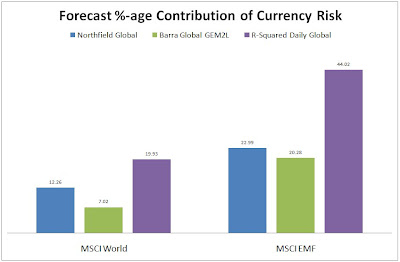
We can see that in both cases the contribution to performance on currency was very material.

What I am looking to highlight is not the benefit of hedging in to USD, (indeed had the investor been Euro-based then the hedged indices underperformed by 4.5% and 5% respectively), but that currency risk is a very real consideration for managers today. The current currency contribution to overall risk was about half 12 months ago as it is today while equity markets are just as risky, if not more so.

Tell us: If you are a global investor, what are you doing to handle your currency risk exposure?

To receive future posts by e-mail, subscribe to this blog.

Friday, April 17, 2009

It’s 10 a.m.; do you know where your money is?

Much more has been written about risk management, investor transparency, and VaR since our inaugural blog in January which discussed whether reliance on VaR contributed to the current economic crisis. That blog focused on the ideas in Joe Nocera’s cover story in the New York Times Magazine that week. As most cover stories focus on politics, foreign relations, human interest, or entertainment, seeing RISK! on the front cover of the magazine that week certainly was a surprise. Over the last three months, the discussion about risk management and VaR has continued, bringing forth more ideas, opinions, and calls for change. A couple of hot topics recently involve the lack of due diligence done by investment advisors who invested client money in the Madoff fund as well as the lack of attention paid by analysts to risk measurements published in the financial statements of banks. Here, I'll look at what's changed since we launched our blog in January and what else you can do to ensure you have an adequate VaR system in place.

Certainly one recent industry event on people’s minds is the Madoff scandal, which Dan diBartolomeo recently spoke about in our podcast series. The Madoff scheme and smaller ones like it have recently prompted many fund of fund managers to require that any fund they invest in have an outside administrator to ensure independence, transparency, and even to calculate NAV. This is a vast departure from current industry practice. Hugo Cox writes about this in the April issue of Alpha Magazine. Key to the understanding of your risk is performing due diligence and making sure that the reported investment performance is accurate. A move in the direction of greater transparency in this area is certainly a positive change that will raise standards in the industry.

On the subject of VaR, Aaron Brown, a risk manager at AQR Capital Management, recently wrote the cover story for the GARP Risk Review titled “Opening the Vault to the Risk Disclosure Data.” He pointed out that not enough attention is paid to the risk information provided in financial statements. Analysts and investors are overly obsessed with quarterly earning to the point where beating or missing the street’s estimate by a couple of pennies can dramatically move a stock. Brown asserts that the reason analysts pay so little attention to the risk disclosures of financial institutions is that the risk information is often too technical for most to understand. He presents two simple alternative risk measures; risk price to earnings ratio (RPE) and risk beta.

One sidebar story within the article titled “Flabby VaR” discussed the characteristics that a VaR measure must possess to be useful. While many VaR measurements will have the correct number of VaR breaks, they will often be set too high or will not respond fast enough to changes in market volatility. For example, your actual daily loss should break a 95% VaR measure 5% of the time or approximately 13 days in a year. If your VaR is broken 12 or 13 times in year, you may think your system if performing adequately. However, if all 13 breaks in the year occur within a single 25 day period of high volatility, it’s time to re-evaluate your VaR measurement so that it more quickly adjusts to short term changes in volatility. It is not at all bad for your VaR measure to surprise you sometimes. Brown maintains that if it does not, it will be the actual losses that surprise you instead. Those surprise often serve as an early warning. So it’s important to dig deep and really test your VaR system. What may look adequate on the surface (such as an appropriate number of VaR breaks) may actually be misleading and what may look like an outlier (such as a surprising increase in VaR) may actually be the exact reason you need your VaR system.

To receive future posts by e-mail, subscribe to this blog.

Thursday, April 9, 2009

When is Cash Policy Effect appropriate?

For risk decomposition, FactSet and Barra have worked in close cooperation to provide Barra analytical calculations with Barra terminology as an option in Portfolio Analysis. One of the most common questions we get from clients is why there are data and calculation differences between Barra and FactSet when it comes to risk-based performance attribution. One of the most obvious differences is that Barra includes an additional component of the analysis called “Cash Policy Effect” that is absent from risk-based performance attribution in FactSet. This can be a source of confusion, and therefore warrants greater understanding.

What is Cash Policy Effect?
The impact of a cash position is separated out of the analysis and calculated first. The effect is analogous conceptually to cash drag and mathematically to the effect you would expect to see in a Brinson attribution that separated out cash at the top level grouping. After the Cash Policy Effect is computed, the benchmark weights are ratcheted down proportionately by the cash weight so there is no active underweight in equity.

Whether to include or exclude Cash Policy Effect in risk-based performance attribution comes down to a very specific question: If your portfolio has 10% in cash, and a given security has a 4.75% portfolio weight while the benchmark weight is 5% do you consider yourself to be overweight or underweight the security by 25 basis points in your analysis of relative performance?

Of course, the answer depends on the investment process.

Imagine a portfolio constructed quantitatively using an optimizer to achieve the optimal positions and weights. Then, as a purely secondary step, the cash/equity split is determined and that decision may well be more about practical business considerations. Clearly, in this case, the Cash Policy Effect makes perfect sense because you want to back out that cash allocation decision first and then assess the portfolio ex-post as it was truly constructed in the beginning. The intention was absolutely to overweight our selected security by 25 basis points.

But, from our experience, we don’t believe that this is how a typical FactSet client constructs portfolios. FactSet won't assume why the portfolio holds cash. FactSet won't introduce hierarchy into a risk-based performance attribution framework (when the absence of hierarchy is the primary benefit of risk-based performance attribution vs. Brinson/Exposure-based attribution) to account for cash. FactSet won’t adjust benchmark weights inside performance attribution calculations (and thereby re-define active security weights) due to the portfolio's cash position. We believe that most likely you intended to have a 25 basis point underweight.

As I said before, the answer depends on your investment process. FactSet remains committed to offering choice, so inevitably Cash Policy Effect will be another Portfolio Analysis option. We just aren’t willing to make this a development priority until it makes sense for our clients.

So, given this explanation, the logical follow-up question is how significant is the difference? Should I really care? First, the more cash in the portfolio, the larger the Cash Policy Effect. Second, more extreme and disparate security returns lead to larger differences. I created a relatively simple example to help quantify the differences (click to enlarge).


Security J is the example from our base question. Reviewing the results, the most important differences are the directional changes in the Active Weight and Total Effect. If this were your portfolio, would you think of Security J as a positive contributor or a detractor from your relative performance? Active weight is crucial because as you attribute performance to the systematic risk factors, you rely on the active exposure to the factor and that critically depends on the active weight in each security.

In conclusion, the decision to use Cash Policy Effect should depend on your investment process. Its misuse can easily generate highly unintuitive results that reduce confidence in the analysis.

Get new Taking Risk entries delivered to your e-mail as they are posted.

Thursday, April 2, 2009

Green shoots of recovery?

More and more articles are heralding a recovery in the markets as underway, and with this week's G20 meeting perhaps some confidence is returning. Indeed as of writing this, the S&P 500 Index is up just over 18% from the lows of early March. I thought it might be useful from a risk perspective to spend a little time examining whether there was any indication of any return to normality of the asset class correlations covered previously on this blog.

I therefore considered an article from the WSJ (Markets having a swinging time) as the basis from which to look at the relationship between multiple asset classes and their recent movement : Equities (5 global regions), Treasuries (US 1-3Yr & 10Yr+) and commodities (Oil, Gold). With diversification being the grail that those of us interested in risk are looking for, we would hope to see a reduction in correlations between these classes.

I looked at the daily correlations of the indices over the last 10 years as my datum, then considered the correlations since September 15, 2008 (Lehman news came to market) and the correlations of the last 60 days. The matrices below show the differences in between the two shorter periods and the datum (click to enlarge):


From a U.S. perspective, the correlation with Europe remains well above the norm and, with the unified approach to fiscal that is being trumpeted from London at the moment, I do not see that changing in the near future.

More interestingly, Emerging Markets and the Pacific Rim are becoming even more correlated with the U.S. (up to 60% over the last 60 days), and while Japan may be starting to return to normal there seems to be no diversification benefit to be had anywhere across equities.

In terms of commodities, the oil price correlation with the S&P 500 is at a 10 year high leaving Gold as the only area of poteantial relief here. Treasuries look to have returned to their long term correlation levels but I think it is too soon after the implementation of the recent quantitative easing to accept these numbers too quickly.

We may well have seen the bottom of the market, but there is no current evidence that any kind of decoupling has taken place that could be leveraged from a risk perspective. The call would seem to be "in or out" as opposed to "where and how much"!

Get new Taking Risk entries delivered to your e-mail as they are posted.